Laser File Design and Prep: The Complete Guide
A clean laser cut starts on the screen, not at the machine. A laser file design prep guide comes down to one habit: get the vectors, the colors, the kerf allowance, and the image settings right in software, and the cut is almost boring by the time the head moves. Across the machines I run, roughly four out of five “the laser messed up” jobs are actually file problems I could have caught in LightBurn before I ever hit start.
I have run diode, CO2, and fiber on this bench for years — an xTool S1 and an enclosed Atomstack X20 Pro for wood and leather, an OMTech Polar 350 for clean acrylic, and a desktop fiber for metal marking. Different machines, identical file discipline. This guide is the whole prep stage in one place: how a laser actually reads your file, vector versus raster, the design software I reach for, the geometry rules that make press-fit joints and living hinges work, where good cut files come from, and how to prep a photo so it engraves like a photograph instead of mud. Each section links out to a deeper guide where it earns one.
How a laser actually reads your file
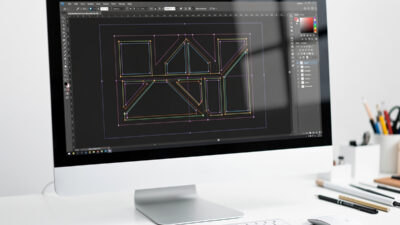
A laser does not “see” your artwork the way a printer does. It follows two completely different instructions: trace this line (vector) or sweep back and forth filling this area (raster). Your file’s job is to tell the machine, unambiguously, which operation belongs to which shape. When a job comes out wrong, it is almost always because the file left that ambiguous.
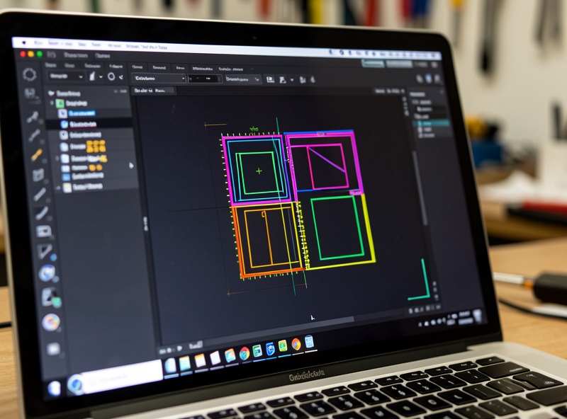
In practice the controller reads geometry plus an assignment. In LightBurn — my daily driver across the diode and the CO2 — that assignment is a color layer. Every shape sits on a layer, and each layer is set to Line, Fill, or Offset Fill with its own power, speed, and pass count. The file you hand the machine is really a stack of layers, each carrying both a shape and a set of marching orders. Get the layer assignments clean and the rest of prep falls into place.
Vector vs raster: the decision that drives everything else
Vector lines cut and score; raster fills and engraves photos and solid areas. That single distinction decides your file format, your software, your design time, and your run time. A vector outline of a logo runs in seconds as a thin scored line; the same logo rasterized as a filled block can take twenty times as long because the head sweeps every row. Choosing wrong does not ruin the part — it just wastes an hour and a lot of material.
The short version: line art, cut paths, and crisp text want vector; photographs, gradients, and textured fills want raster. Most real jobs mix both, which is exactly why color-layer organization matters. I keep cut lines on one color, score lines on another, and any filled engraving on a third, so I can preview each operation before committing. The full breakdown of when each wins, and how run time and edge quality differ, lives in the dedicated guide on vector vs raster for laser engraving. If you only fix one thing about your files this month, fix this.
Color layers and the order operations run
Once you accept that a file is a stack of layers, the next prep skill is controlling what happens in what order. On a mixed job I want the laser to engrave first, then score, then cut last — because once a part is cut free it can shift, and any engraving after that lands crooked. In LightBurn I assign each operation its own color, then drag those layers into the order I want them to run.
Cut order inside a single part matters too: inner holes and windows must cut before the outer perimeter, or the piece drops out of the sheet and the remaining inner cuts miss. Most software handles this automatically with an “inner geometry first” option, but I still preview the cut path before every run. Two minutes of previewing has saved me more ruined sheets than any single setting on the machine.
The design software I actually reach for
You need two kinds of tool: something to design or clean up the artwork, and something to drive the laser. They are not the same program, and conflating them is where beginners stall.
For driving the machine, LightBurn does almost everything on my bench — it talks to diode and CO2 controllers, handles layers, camera registration, and image dithering in one place. I covered the whole flow in the LightBurn complete guide, and the layer logic in fill vs line mode. For designing and repairing vectors, I use Inkscape constantly because it is free, it exports clean SVG, and it edits nodes properly. The full setup — document units, stroke settings, and the export quirks that trip up laser users — is in the guide on Inkscape for laser cutting and engraving. If you want the landscape of paid and free options first, start with best laser engraving software and the rundown of free laser engraving software.
File formats: what to send the laser and why
The format decides whether your geometry survives the trip. Send the wrong one and you get scaled-wrong parts, broken paths, or a vector silently flattened into a fuzzy raster. For cut and score work you want a true vector format; for engraving a photo you want a high-resolution raster. Here is how the common formats behave when a laser reads them.
| Format | Type | Best for | The catch |
|---|---|---|---|
| SVG | Vector | Cut and score paths, logos, parametric box files | Units can import at the wrong scale; check the document size on open |
| DXF | Vector | CAD parts, mechanical drawings, CNC crossover files | Carries no fill or color intent; arrives as bare lines you must layer yourself |
| AI / PDF | Vector | Designer-supplied artwork | May contain hidden raster effects, clipping masks, and text not converted to paths |
| PNG | Raster | Photo and grayscale engraving | Resolution is fixed — you cannot enlarge it without going soft |
| JPG | Raster | Quick photo source | Compression artifacts and a flattened white background; prefer PNG when you can |
My rule: anything that cuts goes out as SVG, and I confirm the document scale the second it lands in LightBurn. The single most common format disaster — a 200 mm part importing as 200 inches, or a vector arriving as a raster — is covered in the prep-and-conversion notes in SVG files for laser cutting. DXF is the format I use whenever a part also has to talk to the router; the laser cut vs CNC router comparison explains where that handoff matters.
Text in laser files: convert to paths first
Text is where clean-looking files quietly fail. If you leave live text in a file and the machine or the receiving software does not have that exact font installed, the lettering substitutes to something else or drops out entirely. The fix is one habit: convert every piece of text to paths before you save the cut file. Once it is outlined geometry, the font no longer matters and what you see is exactly what cuts.
There is a second trap with cut-out lettering. If you cut individual letters from a stencil or a sign, overlapping or touching glyphs leave little floating islands — the center of an O, the bowl of an A — that fall out. For stencils I weld the letters into a single connected shape or add tiny bridges so the islands stay attached. And for engraved text, single-line “stick” fonts run far faster than filled fonts because the laser traces one stroke instead of sweeping a filled area, which is the same vector-versus-raster trade-off showing up at the level of a single character.
Designing to the material you actually have
A file is designed for a number, but the sheet on your bed is a physical thing that rarely matches its label. “3 mm” plywood routinely measures 2.6 to 2.9 mm, and it varies sheet to sheet and even corner to corner. Every slot width, every finger-joint depth, and every box generator input should come from a caliper reading of the actual sheet, not the nominal thickness printed on the rack.
Plywood adds its own problems that live in the file decisions. Cheap ply hides internal voids and glue-heavy plies that cut inconsistently, so a slot that fits on one part binds on the next. Warped sheet sits off the focal plane and cuts shallow on the high spots. I keep a caliper on the bench and measure before I commit the design, because a perfect file against the wrong thickness still produces a part that does not fit.
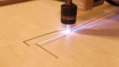
Designing for the kerf: tolerance and press-fit joints
The laser removes material as it cuts — the width of that removed slot is the kerf, and on my machines it runs roughly 0.1 to 0.3 mm depending on material, focus, and air assist. Ignore it and every slot comes out a hair too wide, so finger-joint boxes rattle apart instead of snapping together. Design with it and parts press-fit with a satisfying click and no glue.
Kerf compensation is just deciding who gives up the half-kerf on each side of a joint. For a tight press-fit I size the slot so the mating tab is slightly oversized relative to the cut path, then I test on scrap before committing the real sheet. There is no universal number — my baltic birch kerf is not my cast acrylic kerf — which is exactly why I cut a small test comb first. The full method, with the measure-it-yourself comb and per-material figures from my logs, is in kerf and tolerance for press-fit laser cuts, and you can see it applied to a real build in the finger-joint box project.
Living hinges: making rigid sheet bend
A living hinge is a grid of cut slots that lets a stiff sheet flex like a curve — it is how you get a rounded laptop stand or a curved lamp out of flat 3 mm plywood. The bend lives entirely in the cut pattern, so this is a pure file-design problem. Slot length, spacing, and the bridge width between slots decide whether the hinge flexes smoothly or snaps on the first bend.
The honest part nobody mentions: living hinges fatigue, and a too-aggressive pattern cracks. I dial the pattern to the material and the bend radius, and I always cut a test strip before trusting a hinge in a finished piece. Pattern types, the spacing math, and the failure modes I have actually hit are in the dedicated guide on living hinge design for laser cutting.
Box and parametric generators: skip the math
For most enclosures you should not be drawing finger joints by hand at all. Parametric box generators take your dimensions, material thickness, and kerf, and spit out a ready-to-cut SVG with every tab and slot already compensated. They turn a fiddly afternoon of geometry into a thirty-second form. I use them constantly for project boxes, drawer organizers, and jig bodies.
The trick is feeding them the right inputs — especially the measured material thickness and your measured kerf, not the nominal numbers on the sheet’s label. A box generated against 3 mm when your ply is actually 2.7 mm will never fit. Which generators I trust, how to set them up, and how to import their output cleanly are in the box generator guide for laser cutting.
Where good cut files come from
You do not have to design everything yourself. There is a deep well of free and paid laser files out there — tested box designs, ornaments, jigs, and decorative panels — and a good library saves hours. The catch is that “free SVG” quality varies wildly: some files are clean single-stroke vectors, and some are a tangle of double lines and stray nodes that will double-cut and char your edge.
I treat every downloaded file as suspect until I have opened it, checked the node count, and previewed the layers. Where to find files actually worth cutting, how to vet them before they touch material, and the licensing you need to respect if you sell the result are covered in where to find free laser cutting files. Cleaning up a messy download is a node-editing job — the method is in the LightBurn node editing guide.
The file mistakes that waste the most material
After years of running other people’s files alongside my own, the expensive failures repeat. None of them are machine faults — every one is something a thirty-second check at the file stage would have caught. These are the ones I scan for on every job before the head moves.
- Double-stamped lines. Two identical outlines sitting on top of each other cut twice, widening the kerf into a charred groove and doubling run time. Select all and check the path count against what you expect.
- Open paths on a cut layer. A path that does not close can confuse fill operations and leaves an un-cut gap on a cut layer. Close the loops before exporting.
- Wrong document scale. A file that imports in inches instead of millimeters arrives roughly twenty-five times too big and runs straight off the bed. Confirm the part dimensions the instant the file opens.
- Live text with no outline. Covered above, but it is the single most common reason lettering comes out wrong, so it earns a second mention.
- Tiny stray nodes. Downloaded files often carry near-invisible specks and orphan points that the laser dutifully marks. Clean them out before cutting.
- No frame check. Always frame or preview the job against the loaded material so nothing cuts past the sheet edge or over a clamp.
Running that list is the cheapest insurance in the whole workflow. A ruined sheet of baltic birch costs real money; a thirty-second file scan costs nothing.
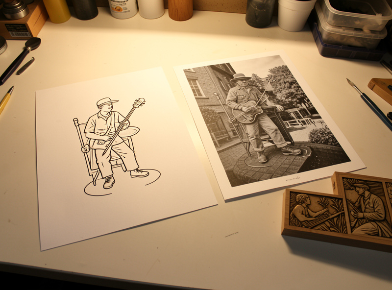
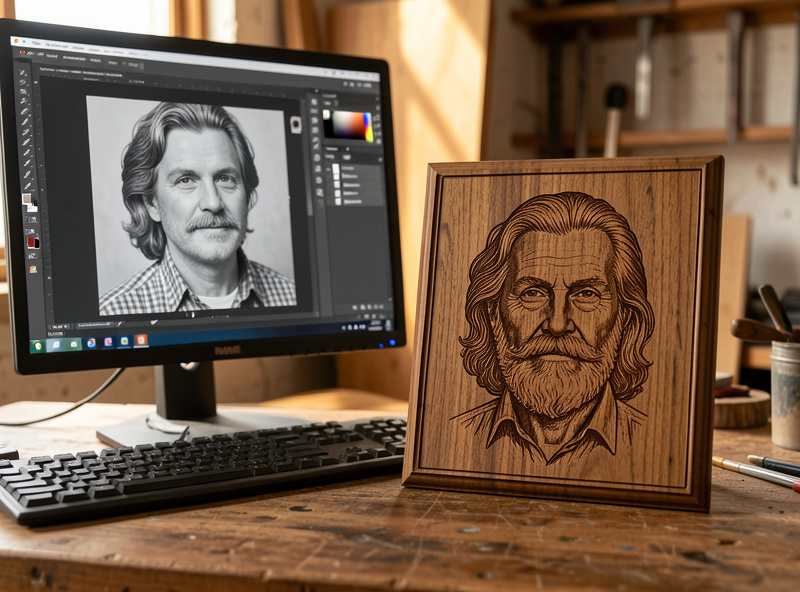
Preparing photos so they engrave like photographs
A photo straight off your phone engraves badly — muddy mid-tones, blown highlights, no contrast. Getting a clean engraved portrait is mostly pre-processing the image before it reaches the laser: convert to grayscale, set the resolution to match your line interval, push the contrast, and sometimes lighten the whole image because wood and slate darken as they burn. The dithering choice you make in LightBurn matters, but it cannot rescue a flat source image.
I prep the photo in an image editor first — levels, a grayscale conversion that respects skin tones, resize to the engrave size, and a touch of sharpening — then take it into LightBurn for dithering. The full pre-processing recipe is in preparing photos for laser engraving; the in-software side, choosing among the dithering algorithms, is in photo engraving in LightBurn and image trace and bitmap engraving. Material matters too — the jet-black photo trick on tile is in laser engraving ceramic tile.
Layers, units, and the small file checks that save sheets
Before any file goes to the machine I run the same short checklist, because the cheap mistakes all live here. Confirm the document is in millimeters and the part is the size you think it is. Make sure cut, score, and engrave each sit on their own color layer. Convert text to paths so a missing font does not silently drop your lettering. Check for double lines — two stamped outlines on top of each other will cut twice and burn a wide groove. And frame the job on the bed so nothing runs off the edge of the material.
This file-prep stage is one stop in the larger pipeline from idea to finished object; the whole arc is laid out in the complete laser workflow, and the per-material power and speed numbers you will pair with these files are in the laser cutting materials guide.
Prep is also safety: the file decides the material
File prep is where you commit to a material, and that makes it a safety decision, not just a design one. The moment I know a job is going to cut, I know what sheet it lands on — and there are sheets that never go near my laser. PVC, vinyl, and any unknown coated stock release chlorine gas when lasered: it corrodes the machine and it is genuinely bad for your lungs — OSHA’s laser-hazard guidance flags both the fume and fire risks that make ducted extraction non-negotiable. That is a hard line on this bench, every time, no exceptions. I keep the do-not-cut list at the file stage so I never design a part for a material I should not be running.
The full reasoning is in materials you should never laser engrave and specifically why you must never cut PVC. And whatever the file says to cut, air assist runs on every job, the exhaust ducts outside, and the machine is never left running unattended — the same fire-and-fume discipline that runs the whole workshop.
Frequently Asked Questions
What is the best file format for laser cutting?
For cutting and scoring, SVG is the best all-round format because it is a true vector and is widely supported, including by box generators. Use DXF when the part also goes to a CNC router. For engraving a photo, use a high-resolution PNG. Always confirm the document scale the moment the file imports.
Do I need to design files in vector or raster?
Both, depending on the operation. Cut lines, scored details, and crisp text must be vector so the laser traces a single path. Photographs, gradients, and solid filled areas must be raster so the laser sweeps and fills. Most real jobs mix the two on separate color layers.
What software do I need to prepare laser files?
You need two tools: one to design or clean up artwork and one to drive the laser. Inkscape is a free vector editor that exports clean SVG, and LightBurn drives most diode and CO2 machines while handling layers and image dithering. They are separate jobs and separate programs.
Why does my laser cut part not fit together?
Almost always kerf. The laser removes a slot about 0.1 to 0.3 mm wide, so uncompensated slots come out slightly too large and joints rattle. Measure your kerf on scrap for that exact material, then size the joint so the tab is slightly oversized relative to the cut path for a press fit.
Can I use free laser files I download online?
Yes, but vet every file before cutting. Free SVGs range from clean single-stroke vectors to messy files full of double lines and stray nodes that double-cut and char the edge. Open it, check the node count, preview the layers, and respect the license, especially if you plan to sell the finished piece.
How do I prepare a photo for laser engraving?
Pre-process the image before the laser sees it: convert to grayscale, push the contrast, resize to the final engrave dimensions at a resolution matching your line interval, and add light sharpening. Then choose a dithering algorithm in LightBurn. Good dithering cannot rescue a flat, low-contrast source image.