Photo Engraving in LightBurn: The 8 Dithering Algorithms Compared
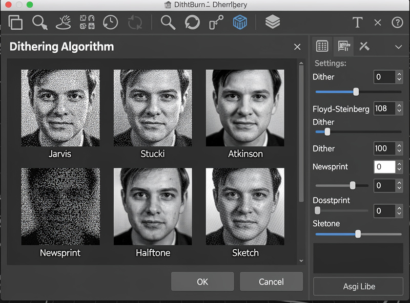
LightBurn’s eight dithering algorithms are the difference between a photo engraving that looks like the source photo and one that looks like a smudgy facsimile. In ~40 words: Floyd-Steinberg for general photos, Jarvis for portraits with smooth skin tones, Stucki for landscapes with sharp detail, Atkinson for high-contrast images, Newsprint for stylized halftone effect. Wrong dithering choice ruins photo quality regardless of laser hardware.
This guide compares all eight algorithms across three test images (a portrait, a landscape, a high-contrast graphic) with the same hardware and material. The goal is helping you pick the right algorithm for each photo type without burning a dozen test pieces. After reading you’ll know which algorithm to start with for any given subject.
What Dithering Actually Does
Lasers can’t produce true grayscale — each spot the laser hits is either burned (black) or unburned (light). Dithering simulates grayscale by varying the density of burned dots. Areas with more dots appear darker; areas with fewer dots appear lighter. The eye blends the dots into apparent gradients.
The dithering algorithm decides where to place dots and how to distribute them. Different algorithms make different trade-offs between sharpness, smoothness, and the visible “grain” of the dot pattern. Some algorithms preserve fine detail at the cost of visible patterning; others smooth the patterning at the cost of detail.
For background on how laser power and material interact with dithering, see our laser materials guide — material choice affects which algorithms produce the best results.
Floyd-Steinberg: The General-Purpose Default
Floyd-Steinberg is the most-used dithering algorithm in image processing generally, not just laser engraving. It distributes dot-placement errors across neighboring pixels, producing a balanced look that handles most photo types well.
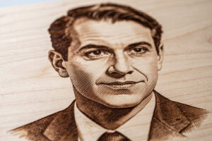
Strengths: balanced detail and smoothness, predictable on unfamiliar photos, works well at moderate DPI (250-400) on most materials. The algorithm is the right starting point when you don’t know what type of photo you have or what algorithm to use.
Weaknesses: produces some visible diagonal patterning on smooth gradient areas (sky, smooth skin). On portraits with significant smooth gradient regions, Floyd-Steinberg’s patterning becomes a visible distraction. For those, switch to Jarvis or Stucki.
Use Floyd-Steinberg for: general photos of mixed content (people in landscapes, products with backgrounds), most candid photos, anything where you don’t want to spend time tuning algorithm choice.
Jarvis, Stucki, Burkes: The Detail-Preserving Algorithms
Jarvis, Stucki, and Burkes (sometimes grouped as “extended error-diffusion algorithms”) are similar to Floyd-Steinberg but distribute errors across larger neighborhoods. The result is finer detail preservation at the cost of slightly slower processing.
Jarvis distributes errors across 12 neighboring pixels (Floyd-Steinberg uses 4). Smooth gradients render with less visible patterning; fine detail in eyes, hair, and textures is preserved better. Best algorithm for portraits and faces specifically.
Stucki is similar to Jarvis but slightly weighted toward sharper edges. Stucki preserves fine textural detail (foliage, fabric texture, brick) better than Jarvis but loses to Jarvis on smooth skin. Best for landscapes and detailed scenes.
Burkes sits between Jarvis and Stucki, optimized for moderate contrast images. Less commonly used because Jarvis and Stucki cover the same use cases more clearly.
Use Jarvis for: portraits, faces, anything with significant smooth gradient. Use Stucki for: landscapes, architectural photos, detailed textures. Use Burkes only when Jarvis and Stucki both produce unsatisfactory results — a niche middle ground.
Atkinson: For High-Contrast Images
Atkinson dithering (originally developed for the early Macintosh) uses a sparser dot pattern than other error-diffusion algorithms. The result is a brighter, more contrasty appearance — very dark areas stay dark, very light areas stay light, mid-tones get pushed toward the extremes.
Strengths: produces strong visual impact on high-contrast subjects (logos, silhouettes, dramatic black-and-white photography). The crispness suits stylized engravings where photorealism isn’t the goal.
Weaknesses: loses mid-tone detail because the algorithm pushes mid-tones toward black or white. Photos with large mid-tone areas (group photos, gentle landscapes, indoor scenes with even lighting) lose subtlety with Atkinson.
Use Atkinson for: logos, dramatic portraits with strong shadow contrast, line art, sketches, anything where you want a bold “engraved” look rather than a photorealistic reproduction.
Ordered, Bayer 8×8, Newsprint: The Pattern-Based Algorithms
Ordered, Bayer 8×8, and Newsprint produce visible repeating dot patterns — they’re not trying to hide the dithering grid. The patterns are intentional aesthetic choices that work well for stylized engravings.
Ordered uses a fixed dither matrix that produces a regular dot pattern across all tones. Looks somewhat retro / 8-bit. Use sparingly for stylized work.
Bayer 8×8 uses a larger 8×8 dither matrix that produces less visible patterning than basic Ordered while still being clearly grid-based. Better than Ordered for most uses.
Newsprint simulates the halftone dot pattern of newspaper printing. Strong stylistic choice that suits vintage-themed engravings, retro signage, and stylized portraits where you want the engraving to evoke print media aesthetics.
Use these algorithms when: the visible pattern is a feature, not a flaw. Newsprint specifically produces gallery-worthy results on portraits when the goal is artistic interpretation rather than photorealistic reproduction. Otherwise, prefer error-diffusion algorithms (Floyd-Steinberg, Jarvis, Stucki).
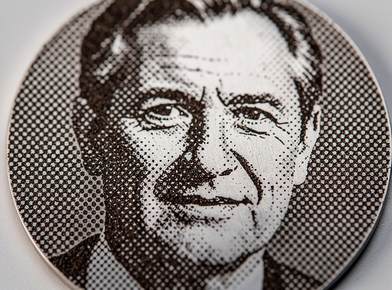
Halftone: The Print-Style Pattern
Halftone produces a dot pattern with varying dot sizes (smaller dots for lighter areas, larger dots for darker areas). It’s the technique used in commercial printing for photographs in newspapers and magazines. On laser-engraved wood it creates a distinctive print-style aesthetic.
Halftone works particularly well on slate, stone, and some ceramics where the pattern translates cleanly to those materials’ surfaces. On wood, halftone can compete with the wood grain visually — try it on light-grained woods (basswood, maple) and avoid it on heavily-grained woods (oak, ash) where the patterns conflict. For photo engraving on polished stone, marble is one of the most rewarding surfaces — the laser engraving marble guide covers the coating and wavelength tricks that pull photographic detail from both Carrara white and darker veined stones.
Use halftone for: stylized art prints, slate engravings, restaurant menu boards with photo elements, anywhere a “printed” look is preferred over a photographic look.
DPI Settings That Matter
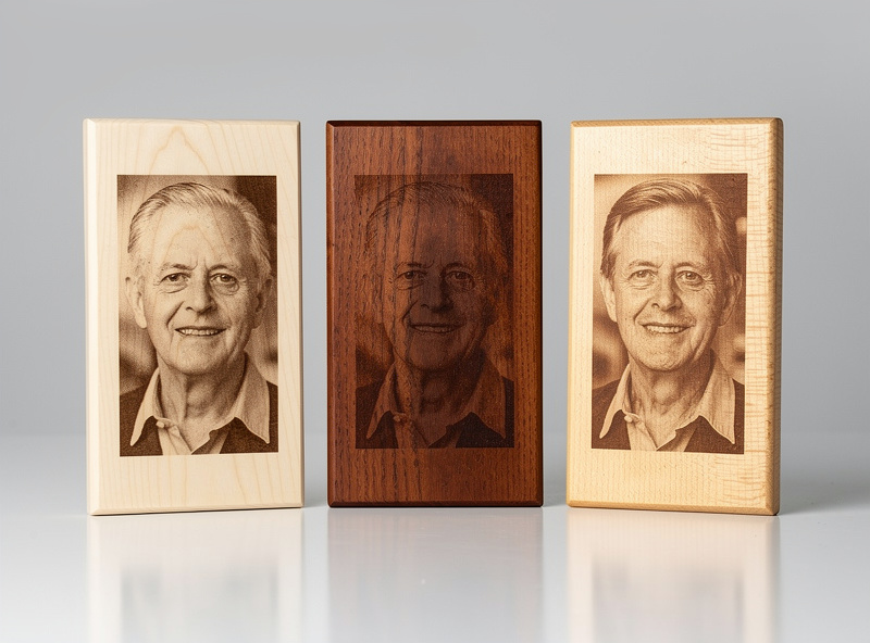
Image DPI in LightBurn determines how densely the laser engraves the photo. Higher DPI produces finer detail but takes proportionally longer. The optimal DPI depends on your laser’s effective spot size, your material, and viewing distance.
For diode lasers (5W to 20W typical): 250-300 DPI is the practical maximum. The diode laser’s spot size limits effective resolution; cranking above 300 DPI burns time without improving visible detail.
For CO2 lasers: 400-500 DPI is achievable on smooth materials (slate, anodized aluminum, glass). On wood, 350-400 DPI typically matches the wood’s grain resolution — going higher doesn’t improve perceived quality.
For fiber lasers (metal engraving): 800-1200 DPI on metals. Fiber spot sizes are much smaller than diode or CO2, allowing finer dot density.
For viewing distance: photos viewed close (under 60cm) benefit from higher DPI. Photos viewed at arm’s length or farther can use lower DPI without quality loss. A wedding gift photo (close viewing) deserves 300+ DPI; a sign viewed across a room can use 200 DPI.
Material Choice for Photo Engraving
Material choice affects photo engraving more than algorithm choice. Some materials inherently produce better photo results than others, regardless of dithering choice.
Best: Light basswood, maple, slate, anodized aluminum (white or color anodized), painted MDF (light colors), leather, glass (with paint coating).
Acceptable: Cherry, light walnut, paper, fabric (heavy fabrics like canvas or denim).
Difficult: Heavily grained woods (oak, ash, hickory), dark woods, metals without coating, plastics (most produce poor contrast under laser).
For best photo engraving results, the material should have uniform color and texture. Wood grain conflicts with photo detail; metal without coating doesn’t produce contrast; plastics melt unpredictably. Stick to the “Best” list for production photo engraving and treat the others as experiments.
See our laser materials guide for detailed power and speed values per material, including the materials that work best for photo engraving specifically.
Frequently Asked Questions
Which dithering algorithm is best for portraits?
Jarvis is the standard for portraits. It preserves fine detail in eyes and hair while smoothing skin tones better than Floyd-Steinberg. Stucki is the second choice for portraits with strong textural detail (beards, hair). Atkinson works for dramatic high-contrast portraits where photorealism isn’t the goal.
Why does my photo engraving look muddy?
Three common causes: too low DPI for the detail level (try 300 DPI minimum on wood), wrong dithering algorithm for the photo type (try Jarvis for portraits, Stucki for landscapes), or the source photo has insufficient contrast (use LightBurn’s image adjustment to boost contrast 15-25% before engraving). All three usually contribute.
What’s the best wood for photo engraving?
Basswood and maple top the list — light, uniform color, fine grain that doesn’t compete with photo detail. Birch plywood is a budget alternative. Avoid heavily-grained woods (oak, ash) and dark woods (walnut, mahogany) where photos rarely render with sufficient contrast.
How long does a photo engraving take?
Roughly 30-90 minutes for a 100×150mm portrait at 300 DPI on a typical 5-10W diode laser. CO2 lasers run faster (15-45 minutes for the same dimensions). Higher DPI proportionally extends time. Plan production photo engraving accordingly — running 4 portraits per evening is realistic on a hobby diode setup.
Can I engrave photos on stainless steel?
Yes with proper coating. Stainless steel doesn’t engrave directly with diode or CO2 lasers — apply Cermark or LBT-100 coating before engraving. Fiber lasers engrave stainless directly without coating but cost much more than diode/CO2 hobby lasers. The coating workflow is the standard approach for hobby laser stainless engraving.
Why does the same photo look different on different materials?
Each material has different burn characteristics and contrast ratio. Maple gives high contrast and crisp detail; cherry gives softer warmer tones with less contrast; slate gives white-on-black with very high contrast. Adjust LightBurn’s image contrast and brightness per material to compensate. Custom material profiles save these adjustments.
Should I edit photos before importing to LightBurn?
Yes — pre-processing in Photoshop, GIMP, or similar dramatically improves results. Standard adjustments: increase contrast 15-25%, sharpen mid-tones slightly, convert to grayscale (LightBurn does this anyway, but you control the conversion in Photoshop), and resize to your target physical dimensions before importing. Pre-processed photos engrave noticeably cleaner.
Related Articles
- Best Laser Engraving Software 2026
- LightBurn Tutorial for Beginners
- Laser Materials Guide
- LightBurn vs xTool Creative Space
- Troubleshooting Laser Cutting and Engraving